Initial EDA
We will run initial Exploratory Data Analysis
Noun Phrase Analysis – implementing spaCy
We will explore noun phrases to try and understand what is being talked about in these reviews. We will overlay with sentiment
Word Embedding Analysis - implementing word2vec
Word embedding analysis will help to show us what words are strongly associated with one another
Initial EDA

First off we want to look at some trended data. To smooth out the daily variance we will average the data using a 30day rolling mean average.
What can we observe?
- The vast majority of reviews in our data are from October 2019 onwards. Oddly so.
- Most reviews are made by women. Maybe not surprising.
Before October 2019 we have few reviews. This is a little confusing. ASOS is a significant site and I don’t see why reviews would be so low until October 2019. The pump in reviews seems to roughly correlate with Christmas and New Years Eve however we don’t see it for the previous year so I doubt it’s that.
TrustPilot might be limiting the visibility of reviews prior to October 2019. If we looked at data for other profiles we might be able to confirm this.
It’s also a little strange that reviews would drop off significantly in April 2019, however this is likely to be because of covid19 and its impact on consumer behaviour.
Let’s look at this data by review type (class)
What can we observe?
- Most reviews since October 2019 are positive..
- …but most reviews before October 2019 are negative
This is a little clearer if we use a different kind of visualisation - this is a Plotly visualisation so you can click and interact with it.
If you click and drag on the period before October 2019, we see primarily negative reviews and afterwards - primarily positive.
Again this is a little odd…why would both the volume of reviews increase suddenly and their net sentiment change so quickly?

Let’s have a look at the length of reviews as well.
What can we observe?
- Pre October 2019 the median review length was much higher than post October 2019.
- We see this by review class and by gender - it seems to be a universal shift.
So the plot thickens!
Overall Observations on Review Length & Review Volume
Pre October 2019 reviews were few and far between (apx.100-400 per month), tending to be longer and tending to be more critical of ASOS. Then suddenly from October 2019 there was a huge increase in the number of reviews (ap.x 2000-5000 per month), they became a lot shorter and tended to be more positive.
I find it a little unnatural how some of these key variables have changed so quickly. Perhaps ASOS began to actively encourage people to leave reviews on TrustPilot which may have attracted a slightly less involved reviewer (shorter review length)?
Let’s move on and explore the content of reviews.
Noun Phrase Analysis – implementing spaCy

Nouns are the things that we talk about.
If we remove the nouns from this review – it’s a little tricky to understand what is being talked about..
No nouns..
“I always use if I can. I find them to be good for and very reliable. I have never had to pay extra for due to their. I wouldn’t mind paying a little extra if I had to because they are so good and offer a longer on most.”
You get a sense of what’s happening, but it’s not that clear.
If we include the nouns it makes a lot more sense.
With nouns..
“I always use John Lewis if I can. I find them to be good value for money and very reliable. I have never had to pay extra for household goods due to their price match promise. I wouldn’t mind paying a little extra if I had to because they are so good and offer a longer warranty on most items.”
We can use spaCy’s English language model to help us analyse how people use nouns.
What is spaCy?
spaCy is a powerful NLP library containing a suite of tools and processes that makes analysing language data very easy.
One of its particularly useful tools is its ability to perform part of speech tagging. This means we can classify words into their various parts of speech e.g. which words are verbs, adjectives, adverbs and so on.
- For this part of the project I want to use this ability to identify nouns in ASOS reviews and extract the phrases in which those nouns are used.
- I then want to apply some aggregation technique so we have a meaningful summary of noun phrases which will tell us what is being talked about in reviews
- I want to find a way to size these noun phrases and make meaningful comparisons between positive and negative reviews
We used spaCy to extract the noun phrases earlier so if you want to see the code then go back to that section and review.
Let’s have a look at what that looks like in a DataFrame after a bit of wrangling.
This is the header of the noun phrase DataFrame for the noun phrases around ‘experience’, for positively rated ASOS reviews on TrustPilot, ranked in terms of length.
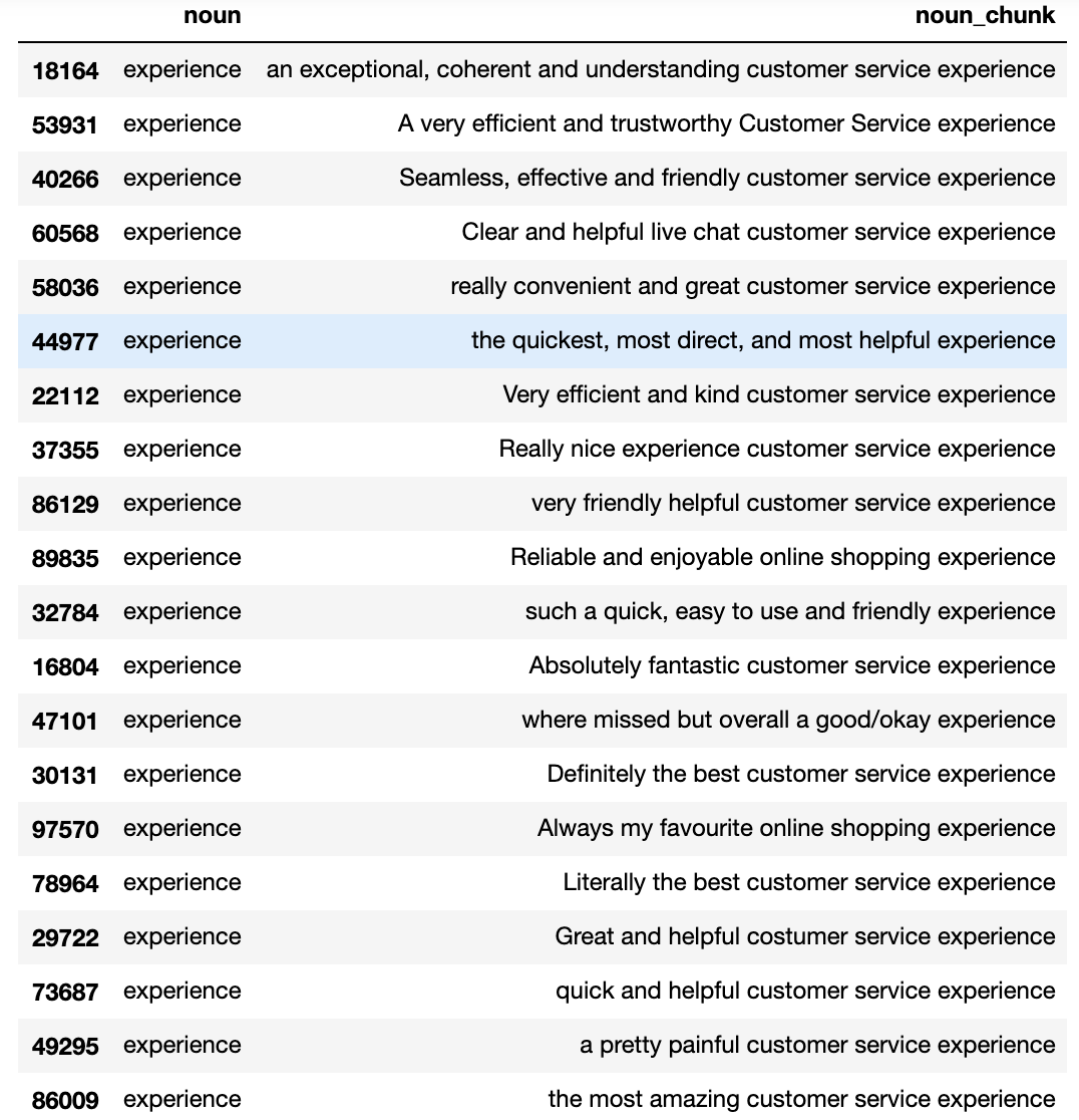
Let’s run the same analysis but for the negative reviews.
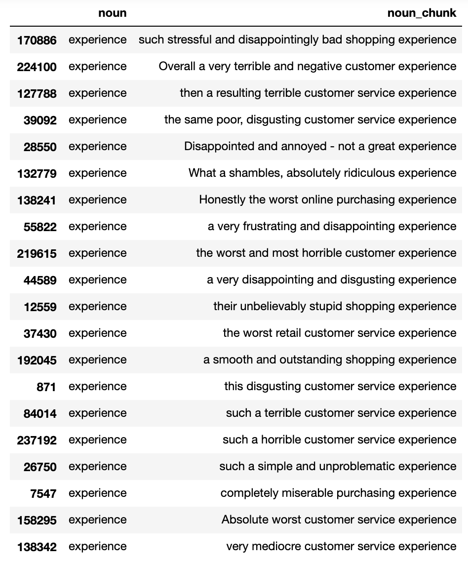
Pretty neat hey. We can begin to see the very different ways in which ‘experience’ is talked about across positive and negative reviews.
We can also look at similar output but for the noun ‘help’..
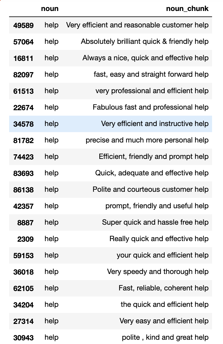
And again, we can look at the same analysis but based on negative reviews..
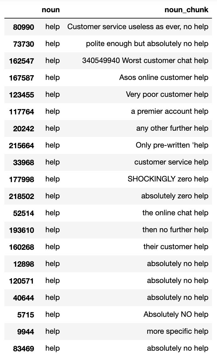
Nice. However despite summary tables being useful, we don’t get a sense of size.
(Plus tables aren’t interesting)

We want to be able to compare the incidence of all nouns and size the myriad of ways in which those nouns manifest in phrases, at scale. It will also be useful to aggregate the most common noun phrase. To do this we can apply a simple most common bigram count - or for more detail the most common trigrams.
Visualising most common noun phrases
A nice way to visualise most common noun phrases is using treemaps. I’ll use Plotly to do this as they look pretty neat and you can interact with the visualisation.
First up let’s look at the most common bi-gram noun phrases for positive ASOS reviews on TrustPilot…
How about we aggregate the data further and look at the most common tri-gram noun phrases for positive ASOS reviews on TrustPilot. Doing this allows us to get more ‘colour’ in the phrases i.e. adjectives and adverbs are more likely cut through on the analysis.
This is pretty good - however it’s not immediately obvious to see where the strongest sentiment lies. As we have phrases that imply some sentiment e.g. ‘great customer service’ - the visualisation as it stands doesn’t quite communicate this very well.
Let’s make our life easier and apply a ‘quick and dirty’ VADER sentiment classification for each of the noun phrases and see how the treemap looks…
Now let’s look at the same analysis but on negative reviews
Word Embedding Analysis - implementing word2vec

We get meaning from language not just from what words are used but the context in which those words get used.
For example the phrase: “kid breaks skateboard”…

is very different to “skateboard breaks kid”

However a simple ‘bag-of-words’ approach like this (an approach that counts what words there are in the phrase) would fall short when trying to differentiate these two phrases. This simplistic approach thinks these phrases are the same, which they aren’t, clearly.

“Context is important when we want to derive meaning””
This is where word embedding representations can help to add more nuance to the relationships between words. By using a model such as word2vec, we can generate word embeddings for any given word in a corpus of text. These word embeddings represent a word’s relationship with a neighbouring word and therefore its context.
What is a word embedding?
Word embeddings are mathematical representations of words that come about as result of a neural network being trained on a corpus of text. Word2vec is probably the most well known algorithm that does this although spaCy comes with a library of pre-trained vectors too. Let’s dig into this some more…
Here is a picture of an Apple.

And this is the word embedding for ‘Apple’ (taken from spaCy’s library of pre-trained vectors)
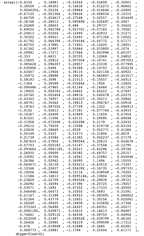
And this is the word embedding for ‘Orange’
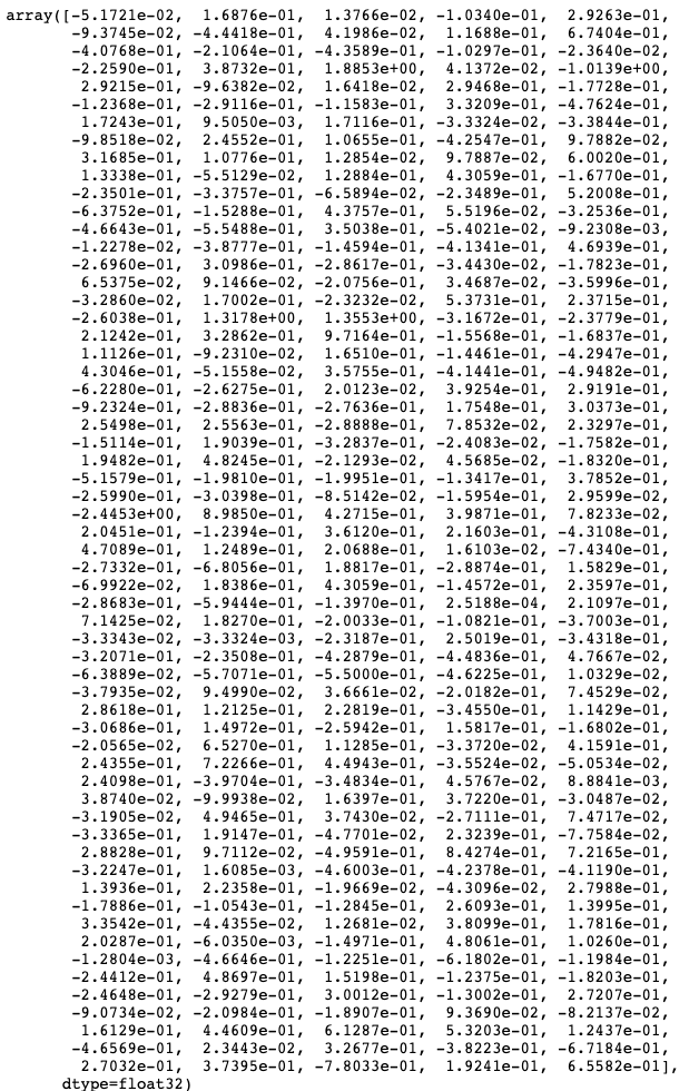
Words that are used frequently in the same context together will have similar embeddings. e.g the words ‘apple’ and ‘orange’ often occur in the same context and therefore the embeddings for these words are similar. If we looked at the embedding for the word ‘car’ - this would be notably different.
“The mathematical proximity of two embeddings is a proxy for the semantic relationship two words have in a corpus”
It’s hard to appreciate similarity / difference without using the appropriate techniques and there’s two I want to talk about that can do this.
- Use Cosine Similarity
- Dimension Reduction and Visualisation (using something like Principal Component Analysis)
Cosine Similarity
Often when we have continuous low dimensional data we would use something like Euclidean distance to gauge similarity / difference. We would use this distance metric with something like a KNN classifier.
However because our vectors have high dimensionality then using cosine similarity is a better proximity metric to use than Euclidean distance.
Cosine Similarity Function

“Cosine similarity calculates similarity as the normalized dot product of two vectors.””
A cosine similarity closer to 1 would mean there is minimal variance between the two vectors whereas a cosine similarity closer to 0 would mean that two words have little relationship with one another.
Let’s look at the cosine similarity of the ‘apple’ and ‘orange’ vectors above. First of all, let’s get some vectors. We can use spaCy for this.
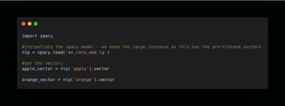
Then we need a function that will calculate cosine similarity. We can use SciKit Learn to do this.
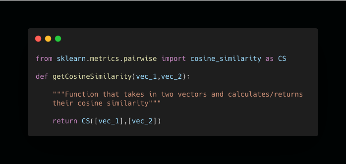
Let’s call this function passing the apple / orange vectors as arguments.
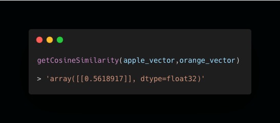
As you can see - a cosine similarity of c.0.561.
For context let’s get the vector for ‘car’ - which intuitively would assume would have lower similarity
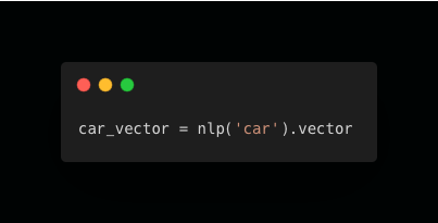
And let’s call the function again…
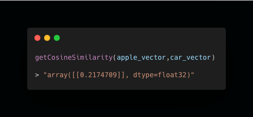
As you can see the vectors of ‘apple’ and ‘car’ are less similar with a cosine similarity of c.0.21.
Visualising Reduced Dimensionality
As we illustrated above, the words ‘apple’ and ‘orange’ have comparatively higher cosine similarity compared to the ‘apple’ vs.’car’.
What if you want to visualise the relationship of multiple words? This is tricky when our embeddings are multi-dimensional. To achieve this data reduction techniques such as PCA (principal component analysis) can help to reduce the higher dimensional data of the embeddings down to a few components that represent most of the variance.
Then we can plot this relationship across two axes.
Let’s illustrate this with the following words:
Below is a function that takes in a string and returns a DataFrame with the two components from PCA for each word embedding.
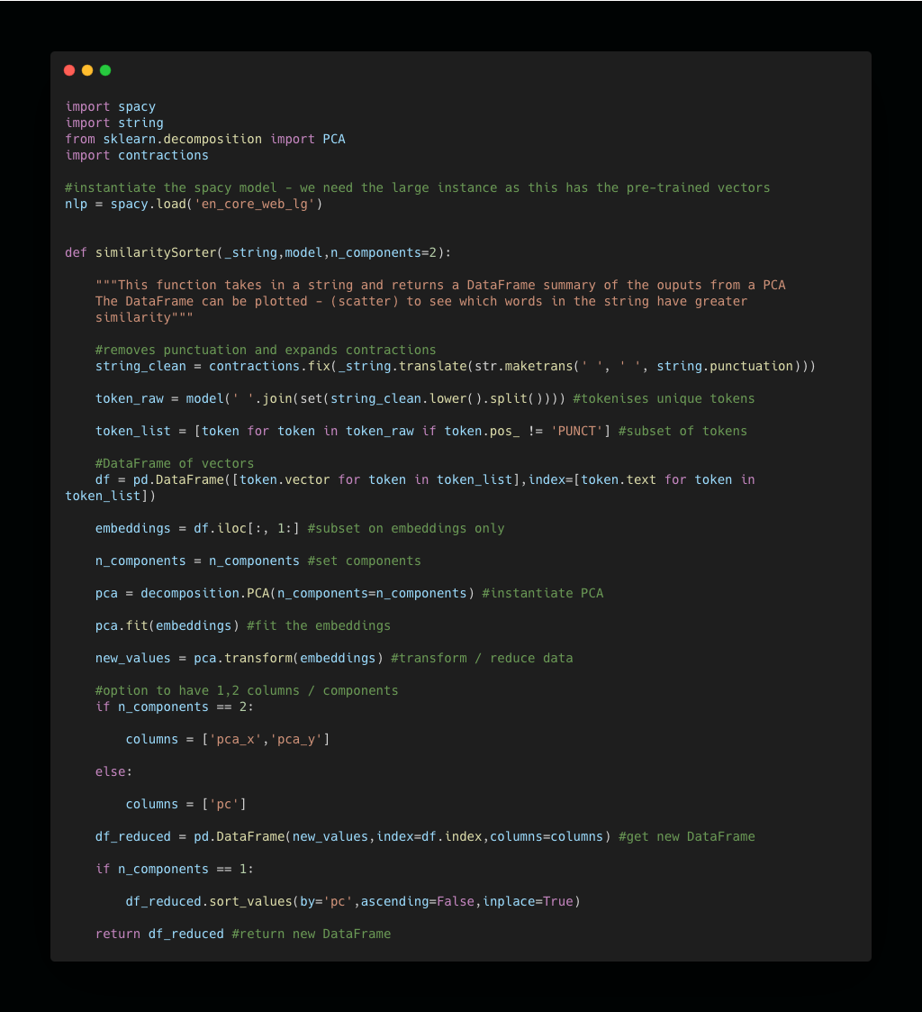
Let’s use this function on these words
- apples (fruit)
- oranges (fruit)
- carrots (vegetable)
- plums (fruit)
- car (vehicle)
- bus (vehicle)
- train (vehicle)
- tram (vehicle)
- road (vehicle infrastructure)
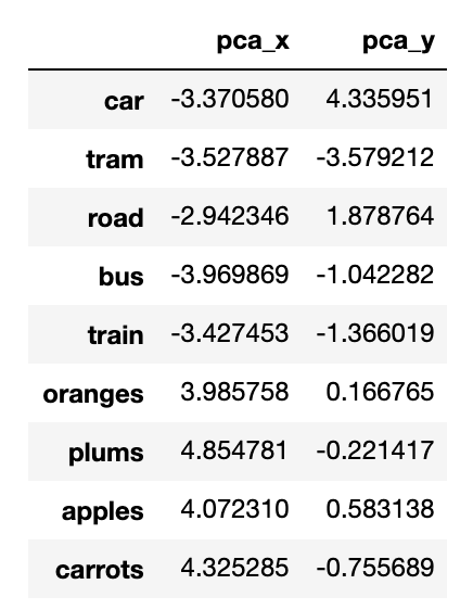
Now let’s plot this data…
It’s very clear from the plot that fruits tend to cluster together and methods of transport cluster together. Even a few wild cards - ‘carrots’ and ‘road’ that have some relationship to fruits/vehicles cluster in a way that makes sense.

I know…why does this matter and how can we use this technique to explore ASOS review data??
We will fit two word2vec models - one on positive reviews and one on negative reviews. We will then have bespoke word embeddings for each class. We will have - in effect - the ‘finger prints’ of each class and can explore the associations words have within each class.
We can select key words of interest and explore which words have a strong relationship with that word in that corpus of reviews. For example, if we were to fit a model on a corpus of bad reviews we might find that when we look at the word ‘delivery’ if we find that words such as ‘late’, ‘bad’, ‘slow’ have strong similarity, then that tells us that delivery is likely a problem.
Here is a word embedding visualisation for positive ASOS reviews. Only nouns (yellow traces) and adjectives (blue traces) are shown.
What can we observe?
- If we look to the left of the plot we see a handful / cluster of nouns that include ‘person’,’team’, ‘chat’, ‘response’ and many others. There are a number of adjectives that have similar embeddings (i.e. are close to one another on the plot) that include ‘polite’,’helpful’,’prompt’,’awesome’. We can infer here that there are many positive adjectives that get used with nouns relating to customer service.
And here is a similar representation for all of the negative ASOS reviews.
What can we observe?
- If we look to the top right quadrant we see similar customer service nouns e.g. ‘chat’,’manager’,’complaint’,’response’ with ‘generic’ in close proximity.
Evidently there are split opinions on customer service with ASOS. We might to do more analysis to see if these embeddings vary by time and if things have been improving. Currently these embeddings include all the data, which means looking by time might be more revealing. But we can save that for another day.
Summary
Hopefully you can now see how that analysing both what people say and how people say are key things to look at when trying to get insights from unstructured review data. Noun Chunks and word embeddings are useful toos that allow us to explore this.
Next in this project we will want to see if we can build AI that can learn from these conversations and predict if a user review is likely to be positive or negative.